Kids' bank
Kids' finance app for the CIS top private bank
Overview
Alfa is the top private bank in CIS countries with 30M customers and $1,32B net profit in 2023. One of the latest tracks is to create a fun and engaging app for minors (6–14) to work with their kids' cards, stickers and other bank products.
Nowadays the financial canvas is shifting, driven by the technological fluency and progressive demands of teenagers. The digital of today's youth footprint will reimagine banking — convenience, personalization, and engagement must be at the core of every financial service crafted for the emerging generation.
My roles
Time
9 months, ongoing
MAIN FEATURES
Colorful, smart
and engaging
Characters
to choose
Open your Catbox
to save money
Check how much
you can save
Emotional approach
in every detail
Gamification features
🤩
Product cases examples
1
Catbox, the piggy bank for minors (6–14)
Global goal
Create engaging feature in minors’ application to help them collect and store their spare money.
Tasks
Increase retention, MAU/DAU, amount of kids cards, amount of intrabank transfers, amount of 14+ clients
Platforms
Android, iOS, web desktop, web mobile
Problems
Data source: custdevs, interviews, workshops
Piggy bank works as a savings account, but kids do not understand interest rates and percentages
The income is paid monthly, but the amount is low in monetary terms and looks rather frustrating to minors
The UI and the texting of the previous layout are boring and not emotionally engaging
Hypotheses
If we shift the focus from interest rate, it will be easier for minors to understand the piggy bank feature
If we rename the income, it will be accepted more positively
If we propose a more colorful interface with clear metaphorical icons, kids will understand it better
If we rename some UI elements, it will appear less dull and more fun to children.
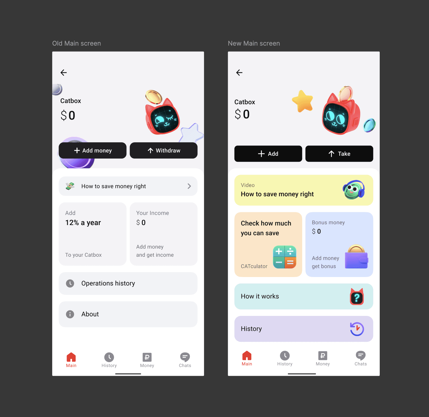
Main Screen Old-New Comparison
Solving
Instead of the 'Interest Rate' widget I introduced a new feature: CATculator, which helps minors to calculate how much money they can save in our Piggy bank.
To create an emotional and engaging effect, I added a 2,5D icon of the calculator, so that this widget will appear self-explanatory to those customers, who are yet low in their reading skills.
Check the CATculator in the section below
The new CATculator widget
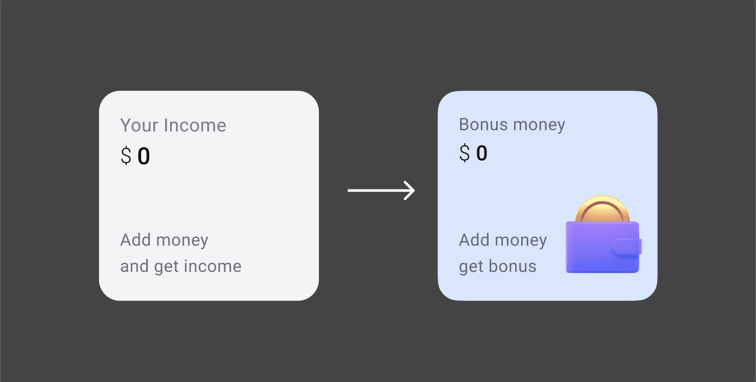
I renamed the 'Income' widget, which confused minors. Based on my research and competitors' analysis, the sum here in monetary terms would be ~$0.3–1/month. So the name 'Income' won't drive our minors as much. I proposed the name 'Bonus money', because 'bonus' is something small, friendly and pleasant.
Here also I added the 2,5D icon falling into the wallet to enhance the meaning of 'bonuses' being real money that customers will get monthly.
The new 'Bonus' widget
The widget 'Operations history' became simply 'History' with appropriate 2,5D icon.
Boring 'About' widget became more intriguing 'How it works'. And also it now boasts the new Catbox-themed icon with a question mark on its screen-face.
While these new widgets look more like slight UI adjustments, the impact on user reaction was huge. Kids and teenagers are no technogeeks, their level of patience is drastically lower. They scan screens and search for emotional anchors to navigate in UI.
2
New CATculator feature
Global goal
Increase users' motivation to add money to the Catbox and keep it, by showing them the further perspective.
Hypothesis
If we show kids how much money they can save (using simple mechanics and emotional backup), they will add money to the Catbox more often and achieve their goals in saving.
Start screen
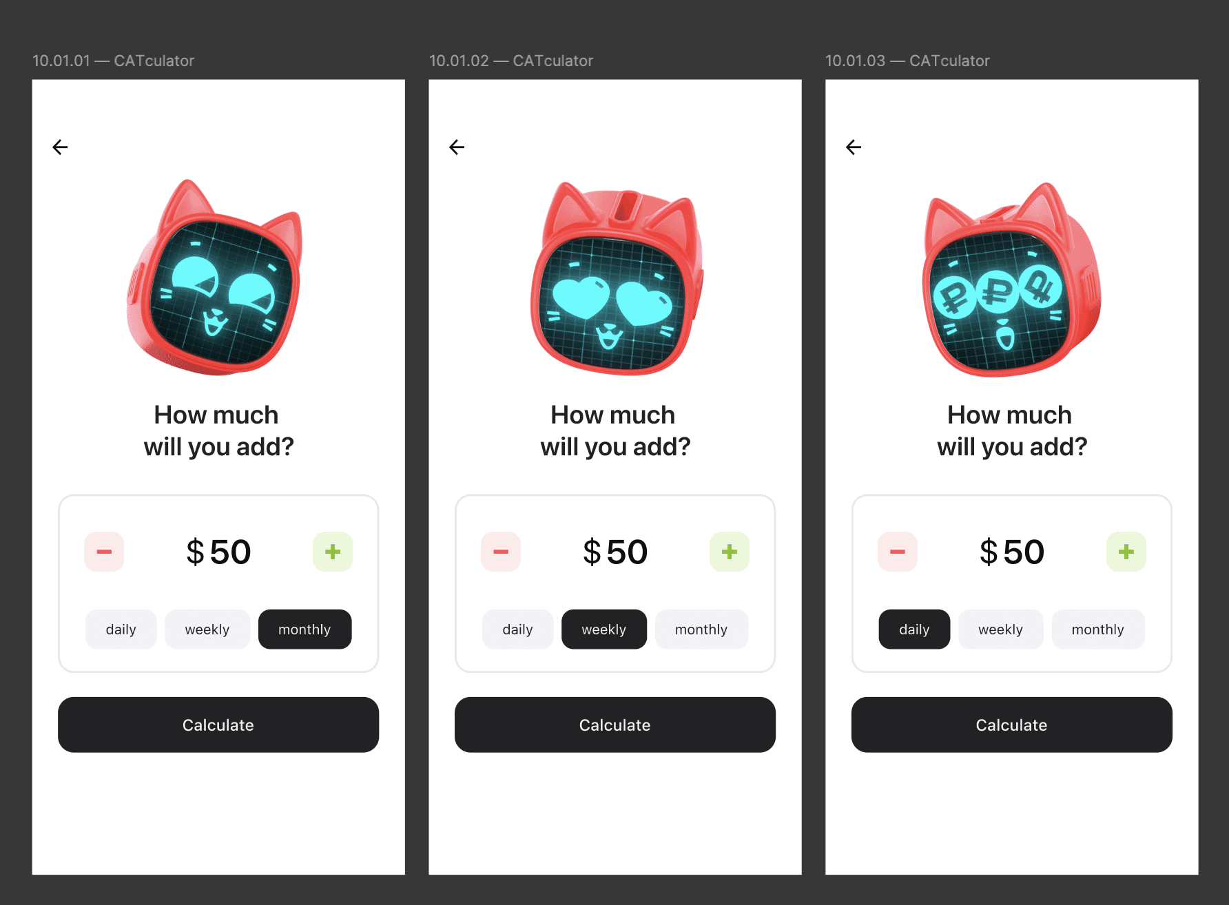
The goal was to create the simpliest savings calculator. I have only two controls here. The focus is on the money amount and the main question. Users can change the amount with big colorful step buttons or by clicking on the amount directly. The second control is time period in chips.
Start screen of the CATculator
The main image, our Catbox hero, shows emotions: reacting on the time period.
Emotional interface animation after 'Calculate' click
After clicking 'Calculate' kids see this interface animation of coins dropping to the Catbox. This little JSON animation is not about calculating money on back. The calculation is made instantly. This tiny Catbox animation is all about emotions: our users see their Catbox character getting happier while receiving more money.
During A/B tests I've received overwhelming positive feedback with this animation.
After 'calculating' process the user sees the final screen of CATculator.
Final screen of the CATculator
On the final screen I've got a carousel of several colorful cards. Thus I was able to minimise the input information on the first screen: traditionally savings calculators require also the time period of savings.
Kids can now have clear vision how savings work. This is especially important for the 6-9 y.o. segment, for these kids are not so good yet with basic math.
For the 10-14 y.o. segment though it is crucial to understand the details. That's why I also introduced modal screens that one can open tapping on each card in the carousel.
Modal screen of the card in the carousel
Here kids can see the details of the income calculation. The amount is decomposed into 3 numbers. The histogram below shows the proportion of these numbers.


