Netology
Product Designer at EdTech SaaS and mobile
Overview
Netology is second biggest EdTech platforms in CIS countries with 3M MAU and $5M AR. It offers multiple online IT courses from 4 months to 2 years long.
Mу roles
User Flow Enhancement: analyzed user flows, identified pain points, and proposed data-informed design solutions that enhanced the student's journey and drive retention and churn metrics.
A/B Testing Strategy: developed and executed a comprehensive A/B testing strategy to optimize student's experiences.
Data-Driven Decision-Making: utilized data analytics to inform design decisions and measured the impact of design changes on key performance indicators (KPIs).
Continuous Iteration: collaborated with product manager, engineers to iterate on design solutions based on A/B test results and feedback from students, experts and tutors.
UI/UX Design: created user interfaces for new features in LMS and collaborated on design system for web portal and multiple landing pages
Prototyping: developed interactive prototypes to validate design concepts and decisions while conducting user testing.
Documentation: prepared clear and comprehensive design documentation, including product flows, and design specifications.
UX research: conducted user testing interviews to understand better target user expectations and identify new product opportunities.
Prototypes system: collaborated with product managers and engineering team to build up the new design system for user testing prototypes.
Design system: created separate design system for educational presentations, that saved 200 working hours each month.
Communication: negotiated with stakeholders and engineers to find the balance between user needs and business objectives.
Non-standard approach: together with 2 experts (professors at Netology) built students’ community from scratch (and zero money) that boosted retention by 56% in 3 months in test groups. Later this practice was enlarged to all Netology courses and saved >2M roubles only in 2021.
Success: was promoted to teamlead role in late 2021
Teamleading: led teams in 'Motivation' and 'Mobile App' tracks.
Mentoring: grow the expertise level of my team
Innovating: Implemented new workflow modes in my team and reviewed them. Upgraded workflows have boosted the speed of my team up to 70%.
Challenges: took part in development of key user scenarios
Business goals: collaborated more with product manager on backlog tasks and KPIs
Mobile development: took part (with 2 other teams) in creating the user interface for new native applications, transferred SaaS desktop experience into mobile (iOS and Android), created design system for mobile applications.
Design Process
For major tasks (L, XL rating) I followed the process, developed according to collaborative and fast-paced team workflow
Design Process workflow
Product cases examples
In 3,5 years I have completed lots of tasks and worked on different products from design system for learning materials to new features for mobile apps.
1
Q&A forum flows. Sorting, levels
Global goal
Improve the forum section with questions and answers to facilitate the flows within and make it easy to work with for experts and coordinators.
Problems
Data source: user’s feedback, curator’s requests, interviews)
Questions page is unclear
Many similar questions, that take place and impede the search
Most of students (65-83%!) do not ask questions, instead they are looking for similar questions and read the answers.
Hypotheses
If we introduce role-tag system that will define each answer with appropriate tag: expert, coordinator, student, then students will be confident about who’s answering without remembering expert’s/coordinator’s name
If we invent new sorting system that will keep most relevant questions and answers on top, then students will notice them more often and won’t have to ask questions themselves (saving time of coordinators and experts)
If we invent new feature “Answer by myself”, then students will be able to cover some basic questions of their classmates while saving time of coordinators and experts, and also will be able to earn achievements for this activity
If we create new feature that allows coordinators and experts to hide similar questions, then students won’t have to scroll dozens of them and they can find information more easily.
Solving
Develop and role-tag system that will define each answer with appropriate tag: expert, coordinator, student.
The badge is right next to person’s name
Develop the categories mechanism that will give each answer the category number based on its importance weight. The more important the answer, the higher it will rise in the answers hierarchy.
We developed 8 categories in total for this feature, from most urgent and complex answers by experts to most common answers like “thank you”. The best part of this was to leave dialogue-like sorting for student who asked question, while for other students sort by categories for they can read the best answer right away.
There are 7 answers to this question, but the best is on top. Later we introduced another feature for coordinators and experts who can now select “the top answer” and it will be sticked to the top and visible without opening the question’s page
Develop the interaction of this mechanism with “time&date” sorting that was used before (example of this mechanism above)
Develop the categories mechanism that will give each question the category number based on its importance weight. Thus we’ll sort most important and frequent answers to be on top of the list. Questions are also sorted by weight, if weight is the same, then by date&time
Develop the flow 'Answer by myself'. Every student can answer any question and if is right and well-written, the expert can tag it with 'right answer' badge. Increase motivation by creating another achieve in gamification system: 'Right answer'.
This was rather cool idea: each course has about 30% of active students who can now use this feature and really help our coordinators and experts. From deep moderated interviews we found that another 10-15% of students engage into this activity after noticing ‘Write answer” badges in forum sections
Develop a flow where the expert/coordinator can hide similar answers from other students, leaving it visible only for the student-author (only with this feature we halved the number of questions in home task sections)
2
Gamification techniques
Global goal
Increase the student’s motivation to do home tasks, finish course sections and follow the pace of learning process.
Hypothesis
If we create a unified page for all student’ achievements where one can follow and review not his/her learning progress, but rather rewards and advise messages, then students will be more motivated to perform several activities connected with achievements.
Features
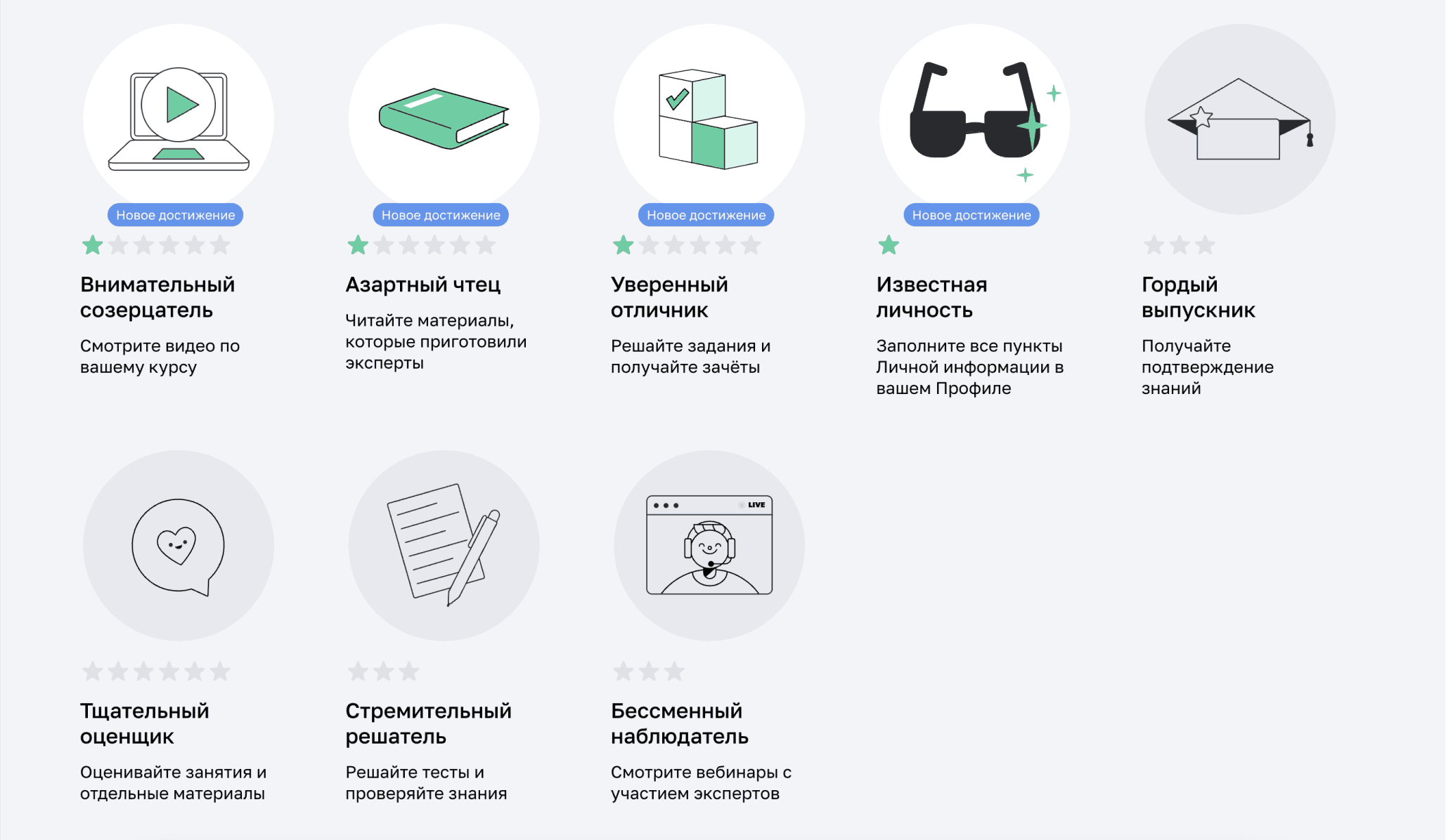
Developed a new section in students’ main page with set of Netology achievements (brand styled badges and star system for levels).
Special colourful banner that attracts attention is on top of students’ main page (on the right)
Badges system with 'star' level ranks
Informational notifications about achievements
Advisement notification in learning flows with a touch of challenge (eg ‘Webinar is starting at 19.00 today. After watching it live you’ll get a 'Permanent Watcher' badge!’)
Motivation notification in reminder flows (eg email after 3 inactive days: ‘Remember this achievement, it was your success in X course! Look at this section, we need to cover it this week’)
All expert’s and coordinator’s reviews also find place on this page. We found that students tend to forget everything about very specific review answers that they get on their course papers and home tasks.
This particular feature became a great success - even more then badges system. Students told us, that they visit the achievements page mostly to reread those expert’s reviews and remember advices and reopen given links
How we measure the result
We had 3 test course group (177 students). Moderated deep interviews with prototypes first then check post-launch activity with the feature
Follow-up and development
The Achievements page became a hit among test groups. We got tons of positive feedback and custdev interviews showed a significant role of this feature in student’ motivation and overall self-esteem. In 1 quarter this page was introduced to all students and courses in Netology (1,5 month development and testing and another 1,5 month to release). Marketing unit was so happy about it, that they rolled 3-month campaign based on this feature to promote Netology.
3
Self-development compass
Global goal
Increase students’ motivation to graduate courses. Decrease churn rate
Hypothesis
If we introduce the new tool that helps organise learning time and set goals, then students will be able to check their progress easily and will be more motivated to finish courses. More to that: person’s goals can change over time, so the compass will guide those changes and student can jump onto different course within Netology.
Flow
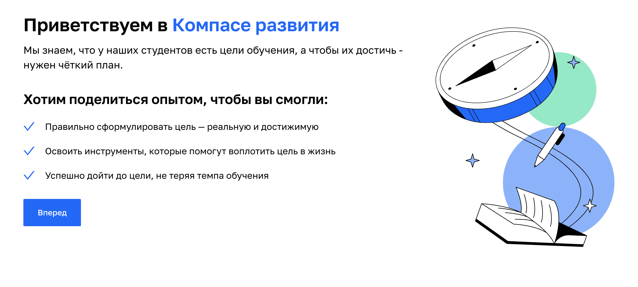
From the first screen we set our goals and manifest the essence of the compass.
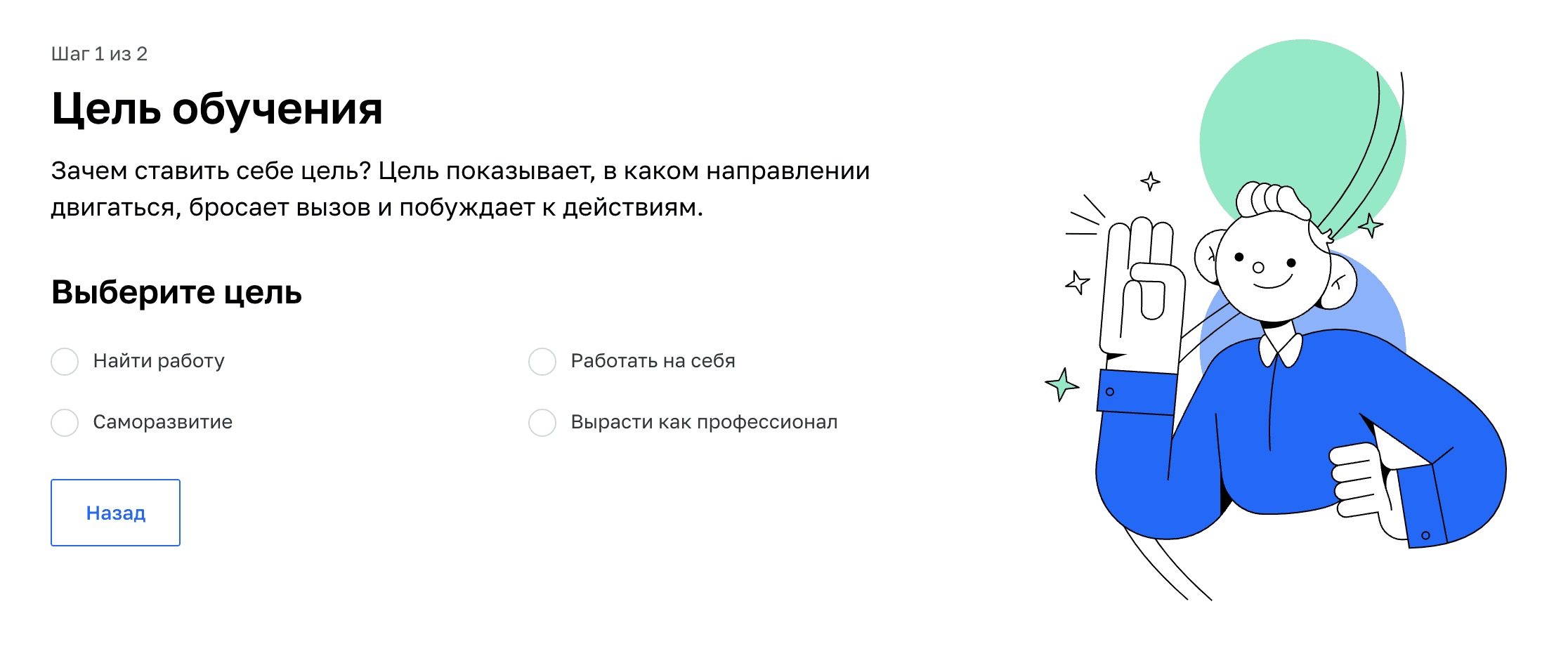
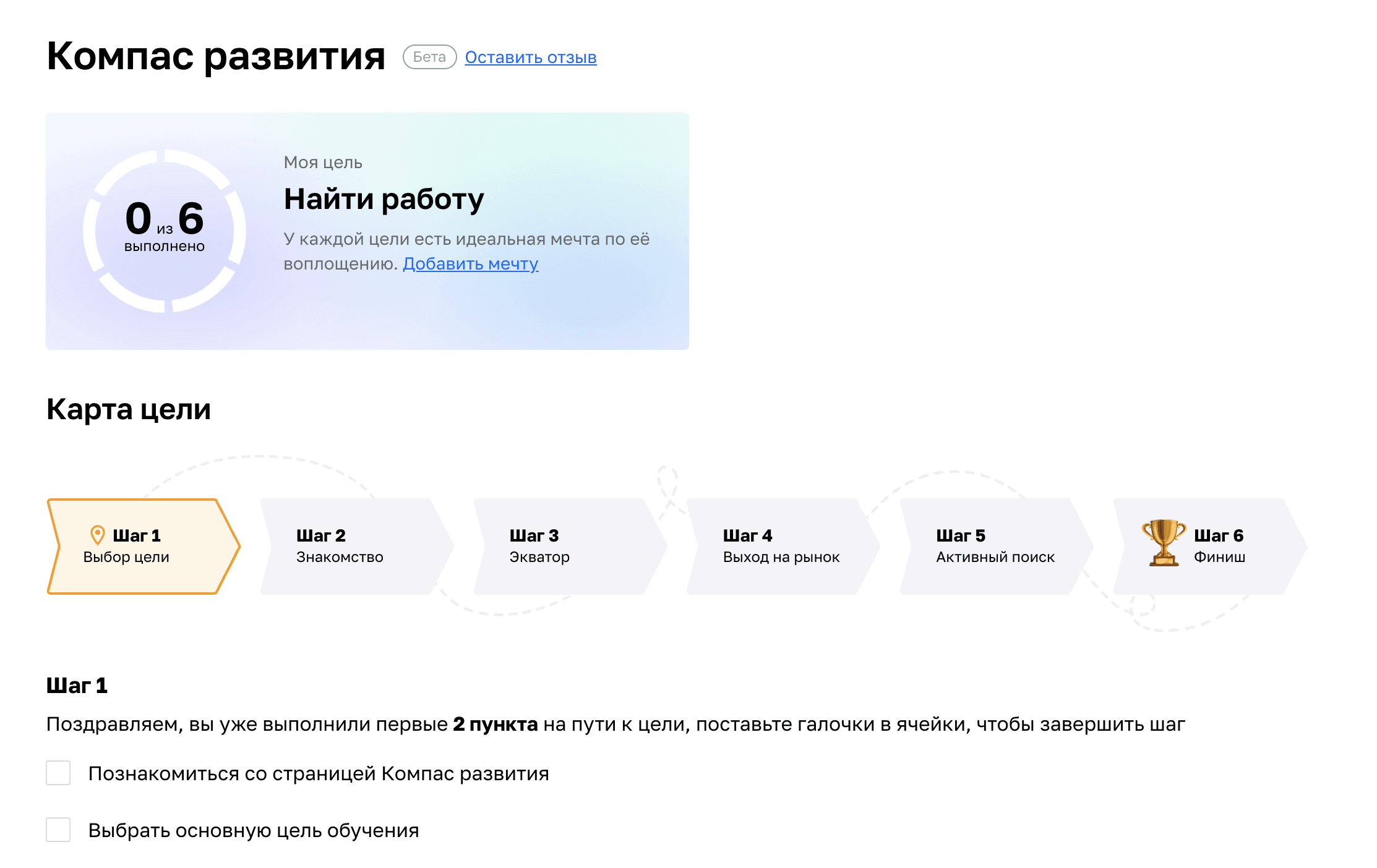
The flow is divided in multiple steps. One step = one action. Maximum focus.
With each new step we teach students to form their goals and rethink their needs. Step-by-step flow with in-between check-ins and follow-ups is the core of this tool.
Outcome
Beta test started in Q12023. On 4th step students gather full pack of documents including portfolio, cover letter, resume and self presentation. This pack is uploaded into Netology career track unit, that chooses the most appropriate jobs and help students to work with offerings and interview process on 5th step.
246 students took part in beta test (Q1-Q2 2023). 67% got their first offers (internships and junior positions) and started to work before graduating Netology.
Follow-up and development
The Achievements page became a hit among test groups. We got tons of positive feedback and custdev interviews showed a significant role of this feature in student’ motivation and overall self-esteem. In 1 quarter this page was introduced to all students and courses in Netology (1,5 month development and testing and another 1,5 month to release). Marketing unit was so happy about it, that they rolled 3-month campaign based on this feature to promote Netology.
4
Auto components for learning materials
Global goal
Increase the speed of building educational presentations
Hypothesis
If we introduce new technical approach for design system (especially for text components), we’ll increase the build speed of educational presentations significantly.
Problems
Presentations design team could produce only 500-600 slides daily, while Netology needed about 1000 at that time.
The team had its own design system, but it was not optimised.
The team didn't have resources to build another workflow and had to hire more designers.
Results
After some research I found that about 70%+ of learning presentation are standard text blocks and lists. Some designers change components with the help of search, others wander in Figma’s left window of design system hierarchy, spending even more time.
I introduced the new component set - ‘Text combine’ - that combined about 85% of text components for design system and have only 6 switches to tune.
Note: this was done long before last Figma update. With the help of variables system the development of this tool would have been much easier.
To the top


