Back
Rentals
Webservice for renting apartments
Problem
Renting a place in different countries may seem hard and complex, especially with high fees from major services.
Solution
Create a renting service for expats who want to find a place and also for owners who want to rent out with ease.
My roles
User Experience (UX) Designer
Interaction (IxD) Designer
User Interface (UI) Designer
FEATURES
Login and boost your ads with paid features
Placing an ad
Registration and looking for an apartment
Problem
In an increasingly globalized world, expatriates often face significant challenges when searching for affordable and convenient accommodation in foreign countries. These challenges include high rental fees, language barriers, lack of local knowledge, and limited access to trustworthy resources. To address these pain points, we aim to develop a user-centric, comprehensive renting app catering to the needs of expatriates worldwide.
Expatriates seeking accommodation worldwide encounter obstacles such as exorbitant rental fees, limited options, language barriers, and a lack of transparency in the rental process. These pain points make the process of finding and renting accommodation a stressful and inefficient experience.
Objectives
Affordability: Reduce the financial burden on expatriates by providing access to rental options with lower fees and transparent pricing.
Choice: Offer a wide range of reliable and diverse accommodation options to cater to the diverse needs of expatriates.
Accessibility: Break down language barriers by providing multilingual support for searching, communicating, and negotiating with landlords.
Trustworthiness: Build trust by ensuring that all listings are verified and by providing a secure rental process.
Scope
My solution will focus on the expatriate market, offering a user-friendly mobile and web application that connects expatriates with affordable and reliable accommodation options. The platform will facilitate the entire rental process, from searching for properties to signing agreements and making payments, with minimal fees and maximum transparency.
Anna Samitch
Solution Approach
I designed a user-friendly, mobile-first application with features such as advanced search filters, secure payment processing, multilingual support, user reviews, and a transparent fee structure. Through partnerships with local experts and reliable property owners, I will provide a trustworthy platform that simplifies the expatriate accommodation rental process, ultimately reducing the financial burden on our users while expanding their choices.
Prototyping
To test the feasibility of our early ideas and concepts, I developed a set of prototypes which we shared with experts and interviewees to gather their feedback, capturing both their enthusiasm and concern.
Interactive prototype flows
Problems
Search Filter Screen
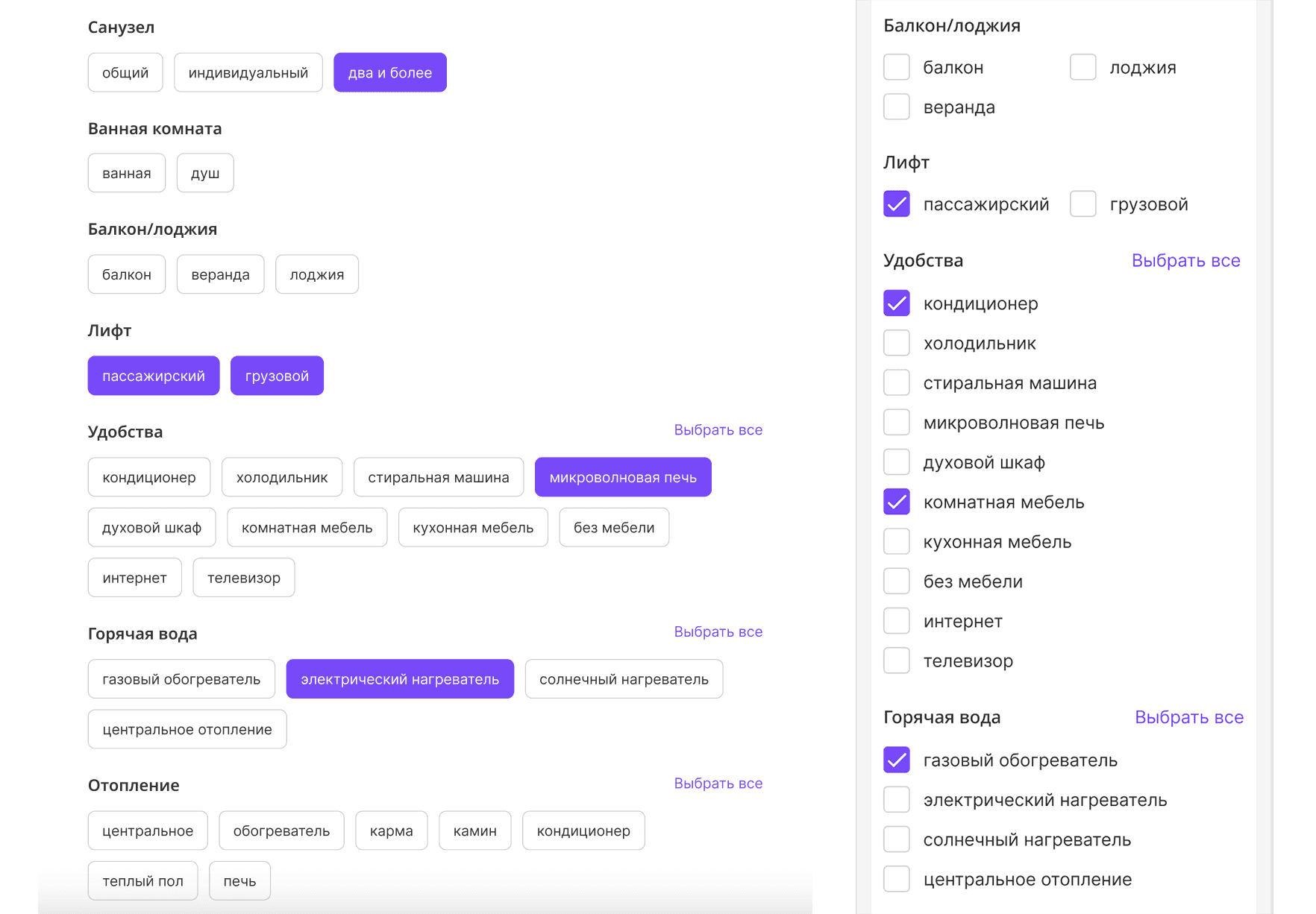
Mobile screens have limited space, making it challenging to display a comprehensive list of filters without overwhelming users. Prioritizing and presenting filters effectively becomes a critical challenge. I have tested two major solutions:
1) Having all filters on the same screen
2) Hiding filters in sections (e.g. 'appartment', 'amenities' etc)
A/b testing shows that almost 90% of users prefer first variant even on mobile screen with extensive scrolling. Typical statements
1) I may miss out on important filter option
2) I want to see every option in filter screen and I'm ready to scroll until I find it
Additional filters screen comparison: desktop, tablet, mobile (left to right)
Placing object screen
User flow for adding a new object to system database can boast the same problem, or even worse. While on the tablet screen I introduced kind of 'big chip' button to activate amenities, the mobile screen was left with ticking select
New rental object sceen: tablet and mobile
User flows
The main user flows for the renting app include the process for individuals seeking to rent apartments, where users initiate their search, input preferences, apply filters, browse listings, save favorites, contact owners, and schedule viewings; and the process for individuals renting out apartments, involving the creation of an account, logging in, adding a listing with property details, photos, contact preferences, and availability, and finally, publishing the listing on the app.
Macro User flows for Landlords and Renters
This is an ongoing project, so updates will come soon
To the top


